

Credit Karma
UX/UI Design for Web
At the end of 2018, Credit Karma was entering an exciting new chapter for its business. They were planning to expand their financial services to the United Kingdom during the second quarter of 2019. Using insights they learned from launching in Canada, Credit Karma developed a strategic plan that included working with freelance digital product designers and design agencies to grow its international business. Ahead of hiring an in-house design team to focus on the UK, Credit Karma worked with Funsize and myself to jump-start the design effort and help set a foundation for future success.
The following is a recount of process, research, learnings, and design deliverables I contributed as a contract product designer for the launch of Credit Karma UK. I worked directly with design leads and design directors from Funsize and Credit Karma to realize the project.
We contributed to a strategic growth plan
by up-cycling an existing experience.
At the start of our engagement, Credit Karma’s project lead shared a presentation which outlined how our work would be a part of a strategic plan to efficiently enter into the UK market by not starting from scratch but by acquiring a business partner. Enter, Noddle—
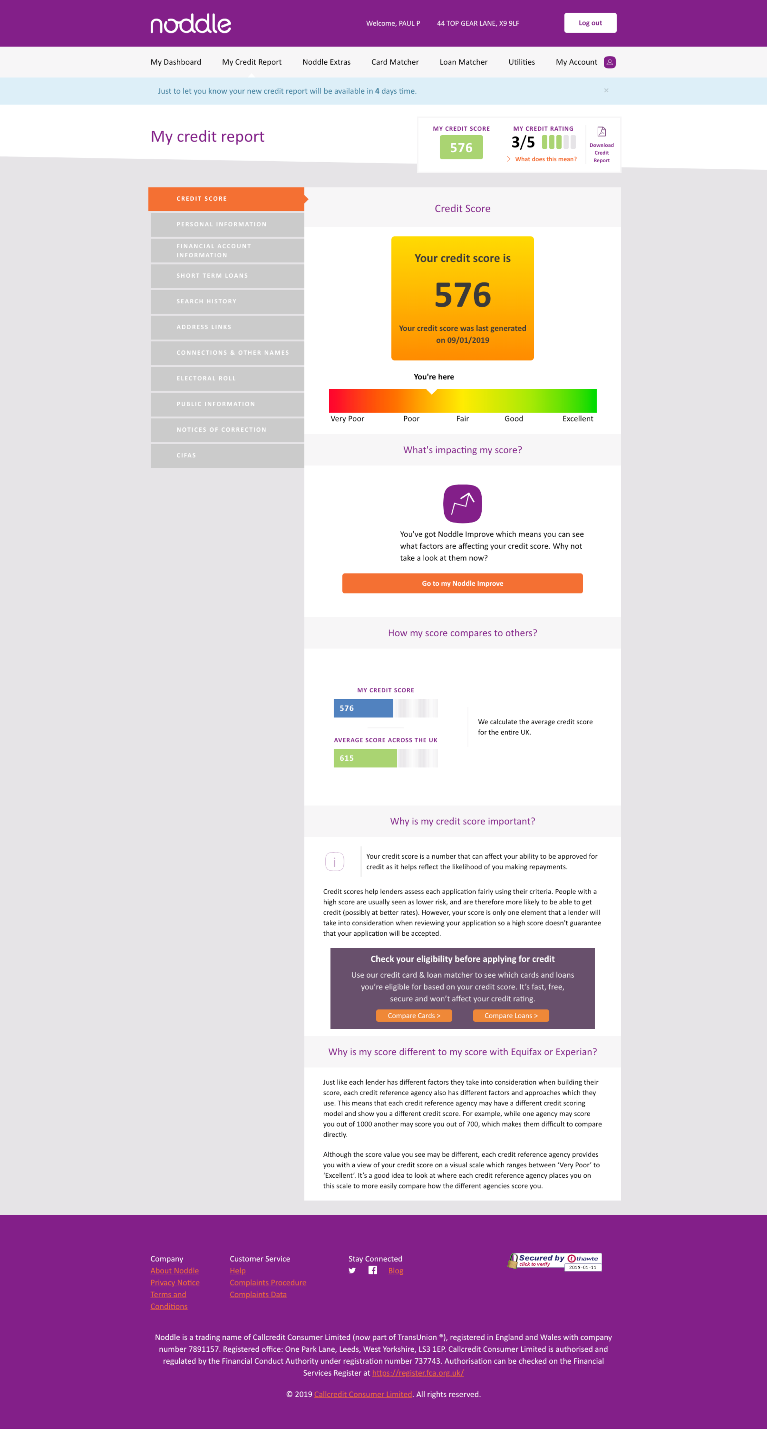
From a visual design perspective, Noddle’s website was remiss and not mobile optimized—but their code-base, engineering team, and existing customer reputation made them a viable partner for Credit Karma’s growth into the UK.
Below are screenshots from the starting point of our Noddle redesign.


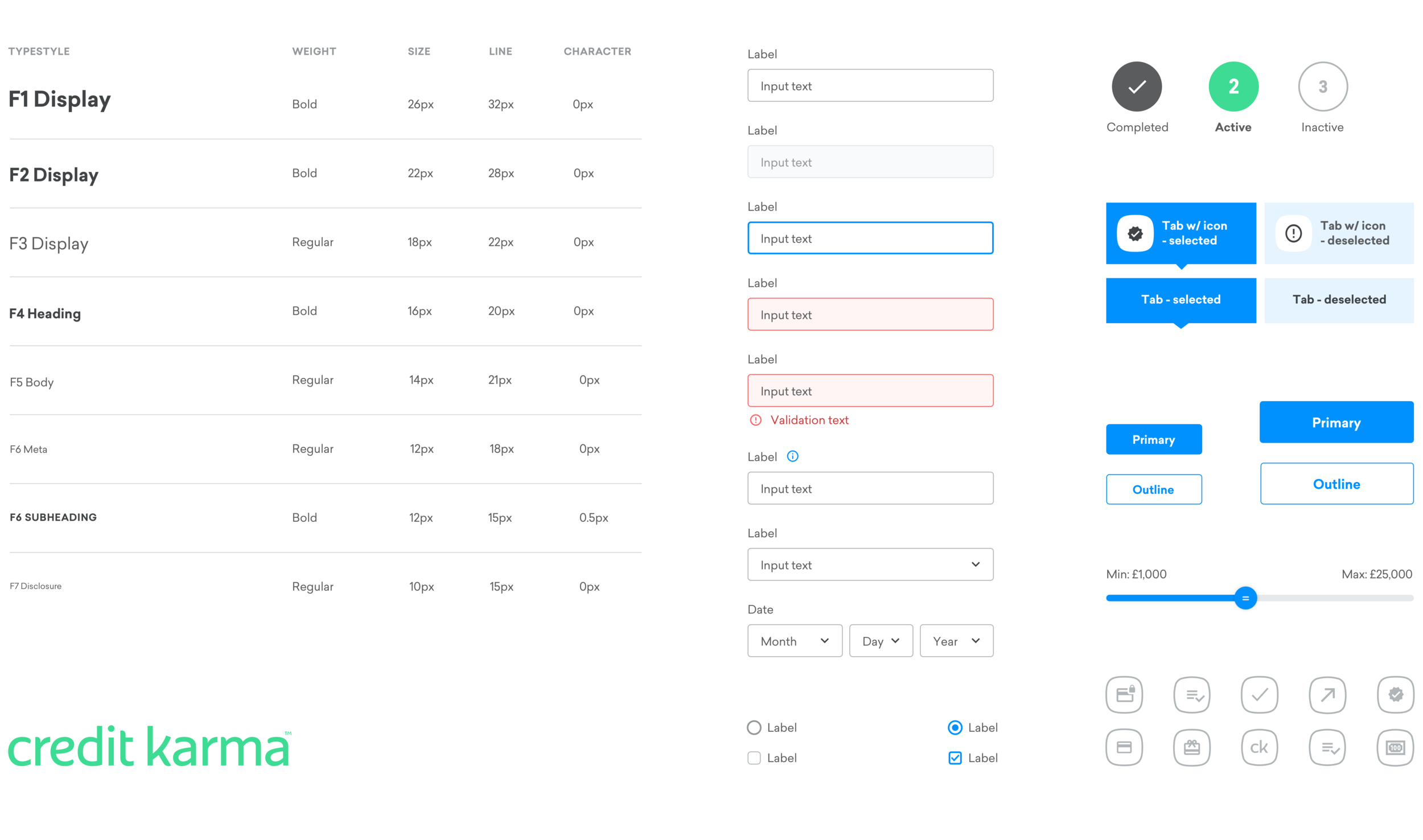
Below is a sample of the design system that we used to shape the digital experience for Credit Karma’s UK launch. It was a sibling to the system used on Credit Karma’s product’s in the US. The only reason that system was not used verbatim, was because of the strategic decision to not build from scratch and to instead reskin Noddle’s existing site. This meant certain graphics and interactive elements which were novel to Credit Karma’s typical design system had to be modified or added.
Understanding our British Customers
From a marketing perspective, Credit Karma understood the need to communicate the value of their services in a way that resonated with their new potential customers appropriately. To produce a well informed perspective about my work While Credit Karma hired a marketing research firm in the UK to produce a marketing survey—
• I attended the SXSW conversation with EU commissioner Margrethe Vestager about digital privacy
• Conducted a first hand interview with a former UK resident.
From our research, we learned that the British are generally uncertain as to why good personal credit is important and have a high expectation for how companies manage digital privacy and use personal financial information. While American’s are comfortable with trading privacy for convenience, the British are much more protective of their personal privacy—especially online, and even more so when it comes to a digital financial services.
These insights would ultimately inform our thinking on the marketing website.
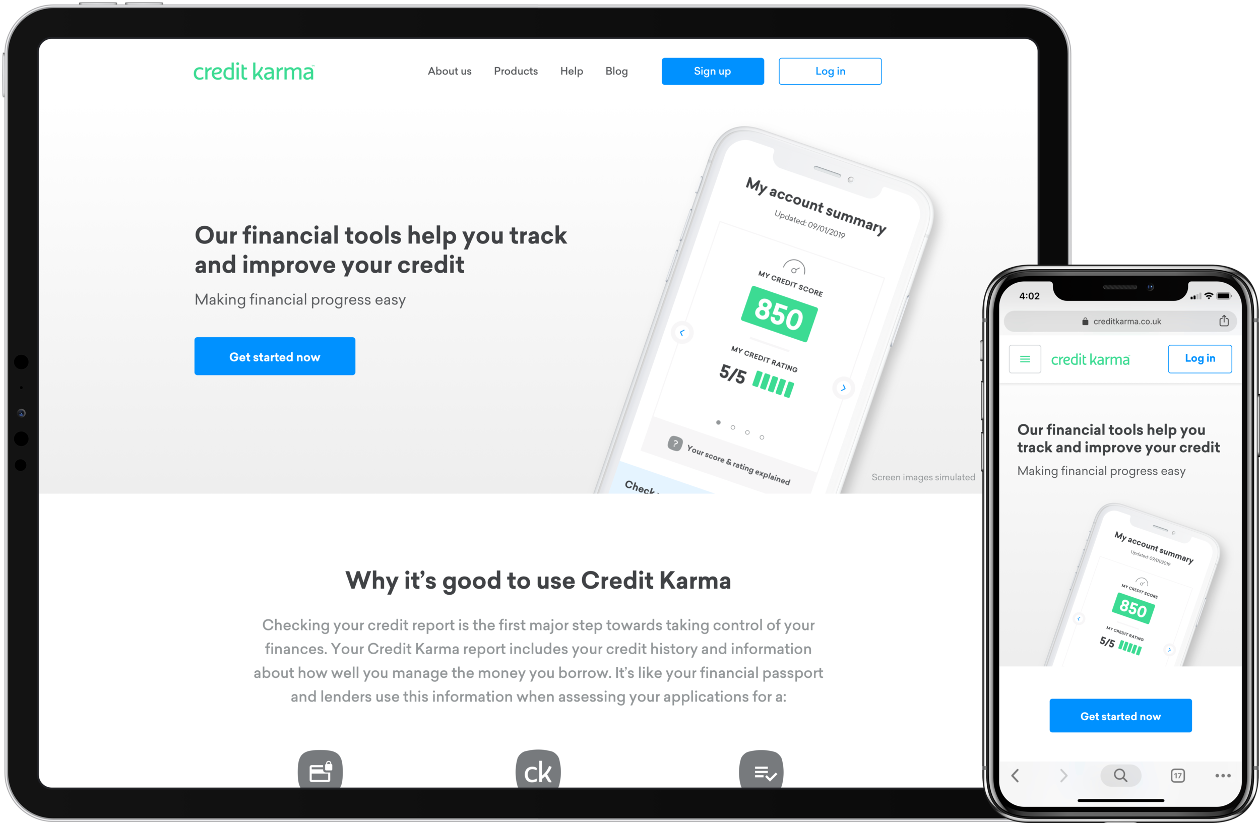
The Marketing Experience
The marketing experience consisted of the home page, about page, login page and registration experience. The marketing and logged in experience would leverage Credit Karma’s existing design system and need to be completed in 4 weeks (very fast given) since it would need to develop first because it would influence and need to correspond with TV ad messaging.
The initial landing page design was created to display marketing messaging that communicated the primary offering of Credit Karma, while showcasing the digital tool for improving personal finances, and providing potential customers with an immediate way to sign up for an account. Our secondary goals for the landing page were to provide existing customers a clear way to login and for undecided customers to learn more about the value of Credit Karma’s services.
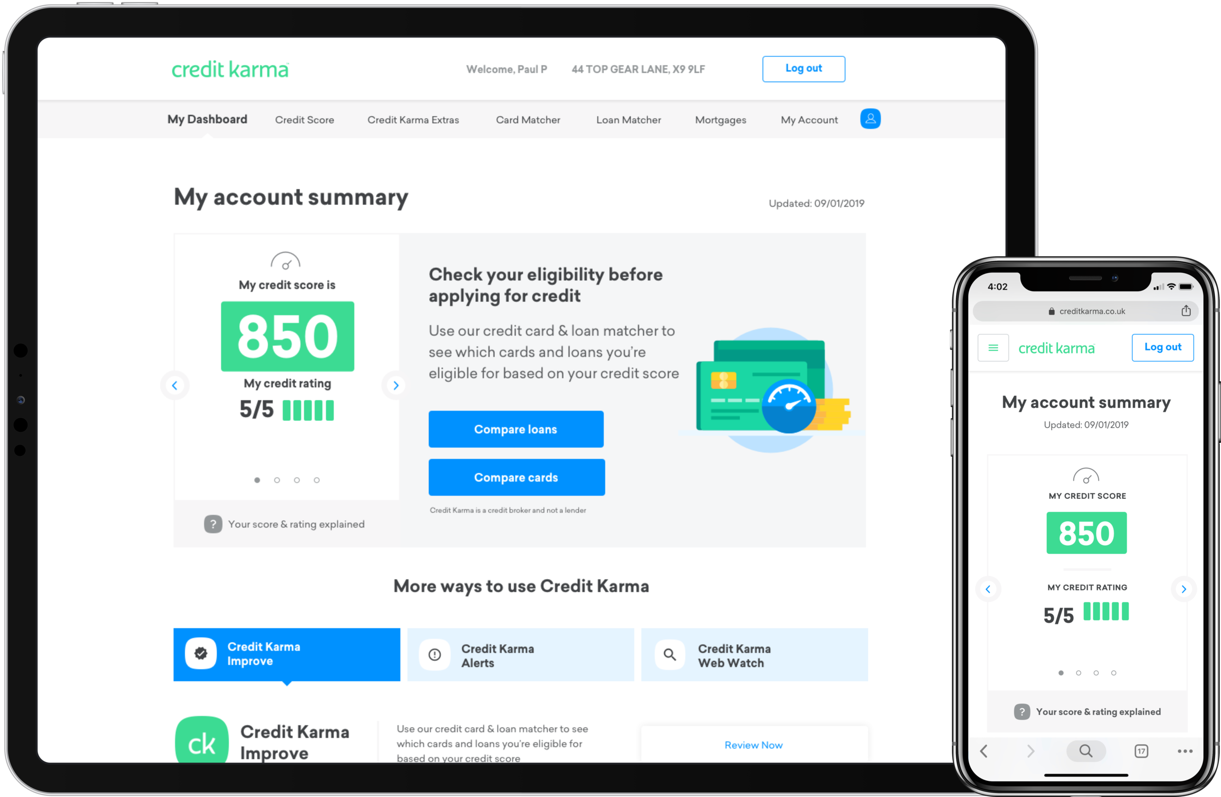
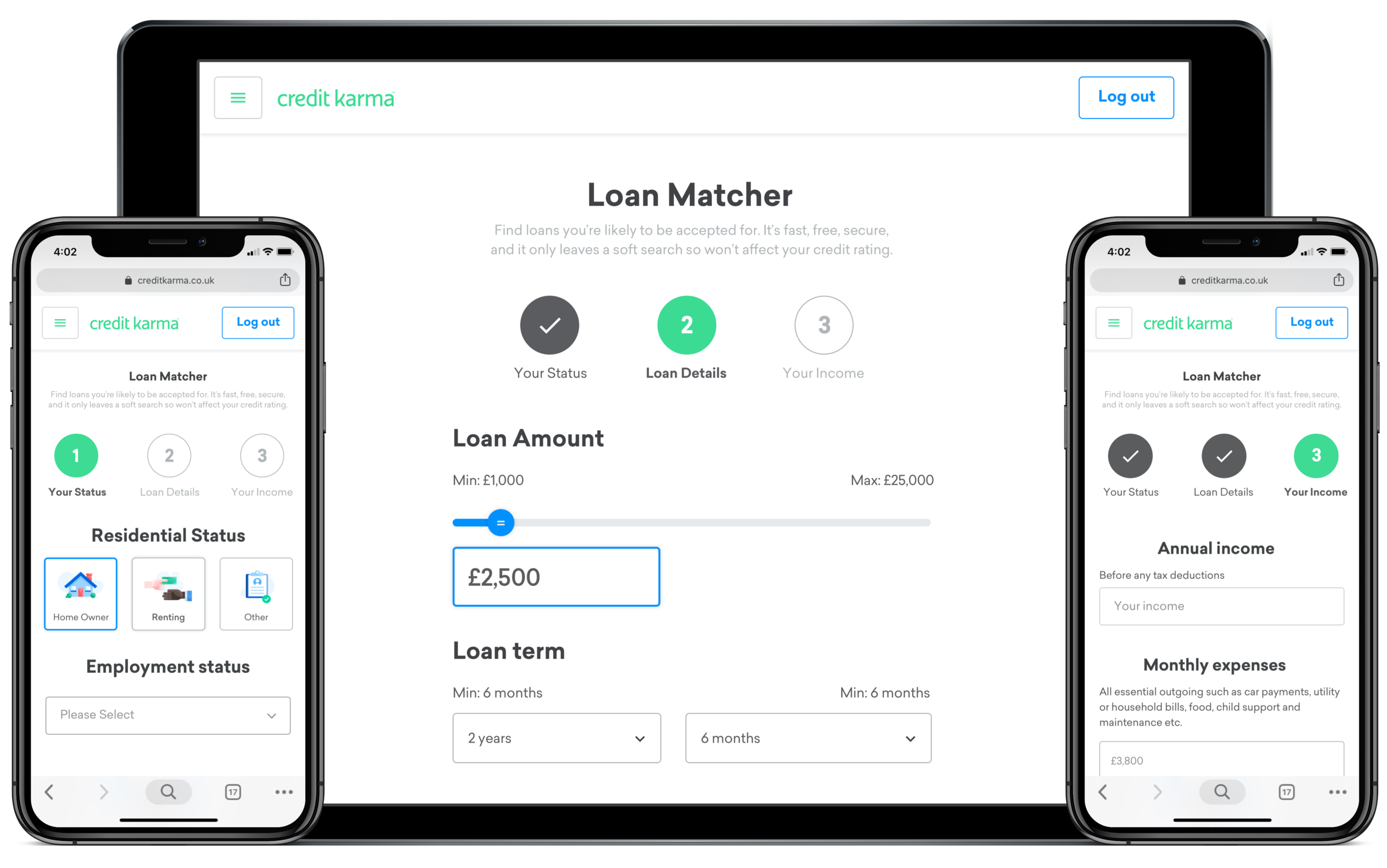
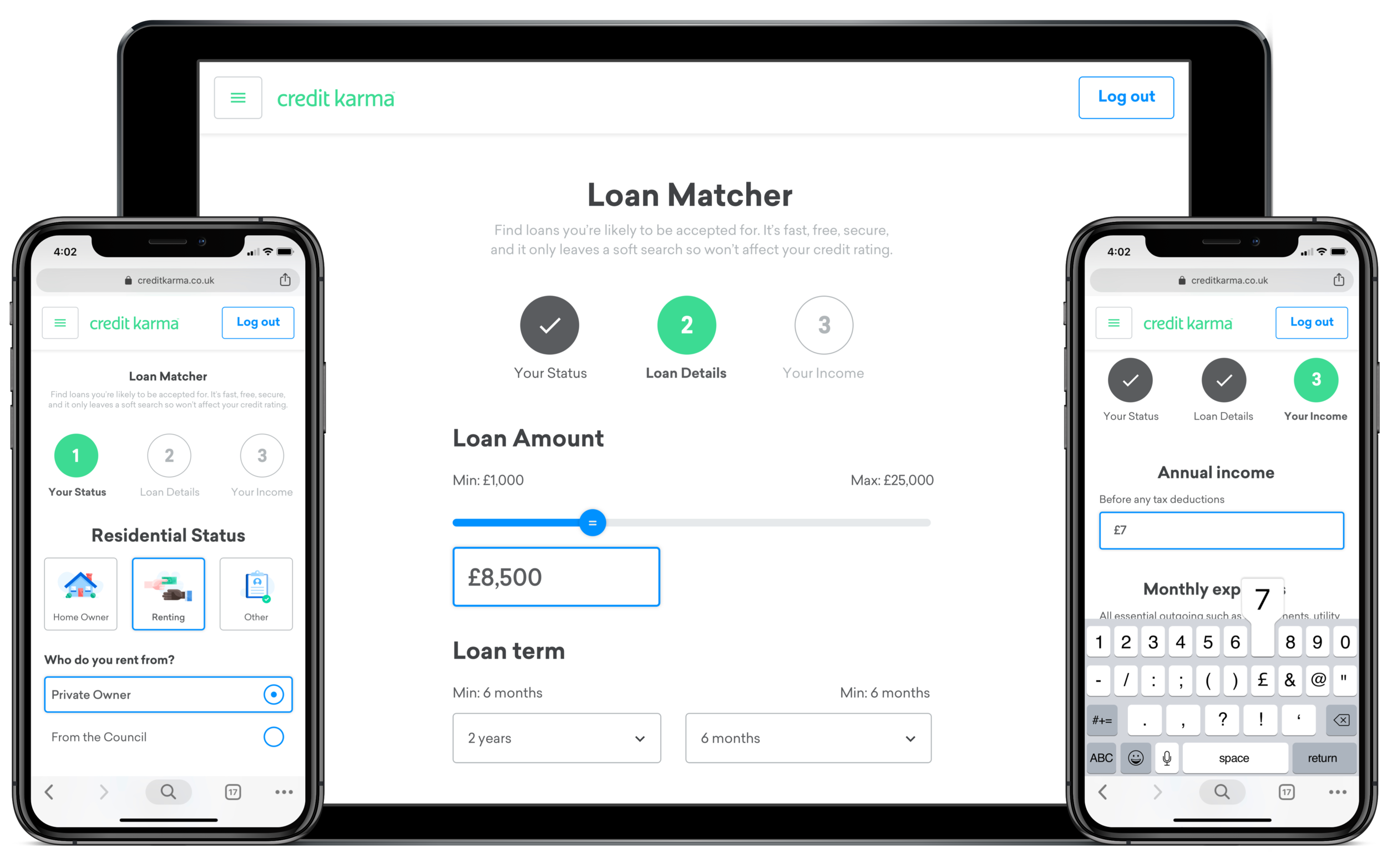
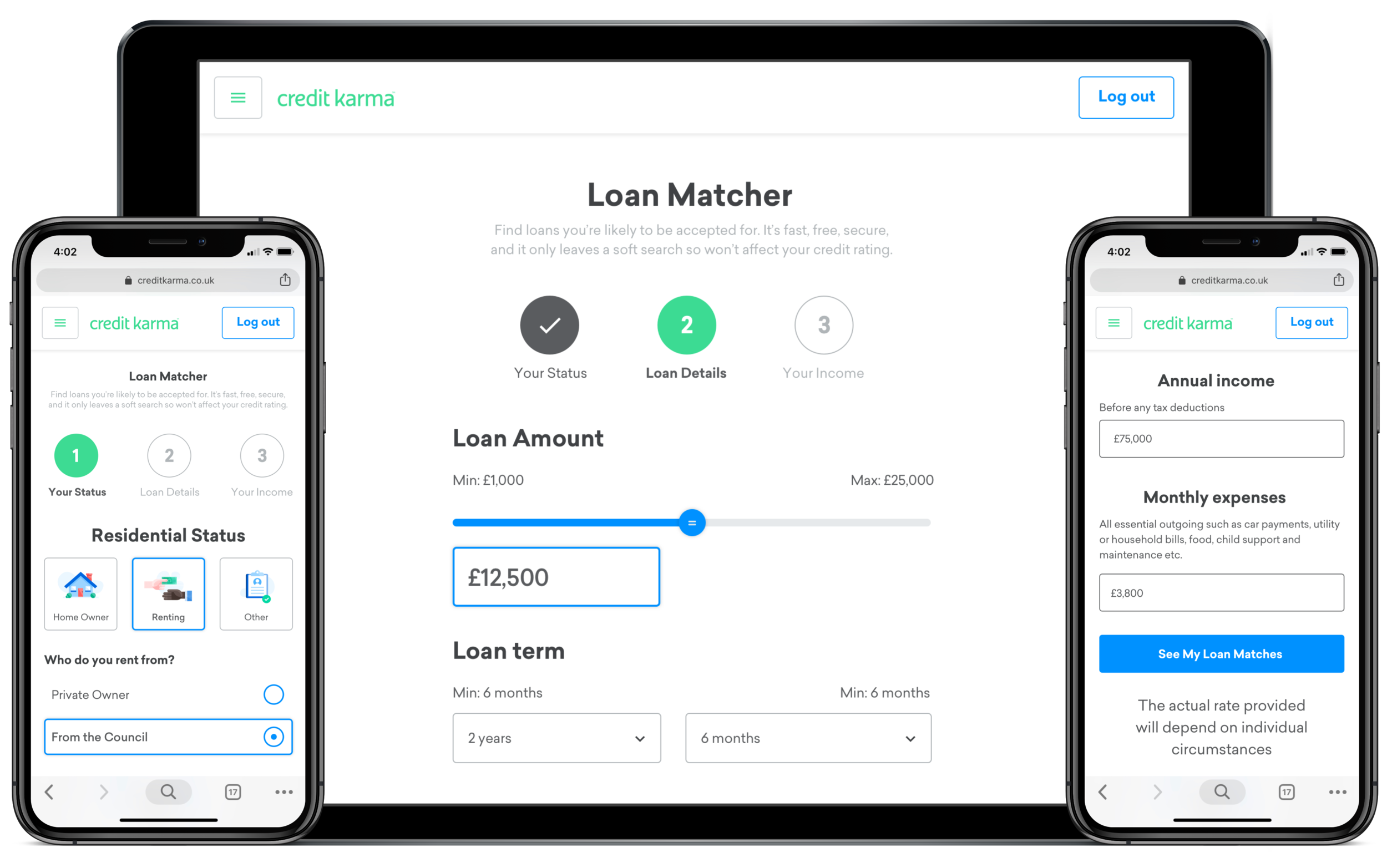
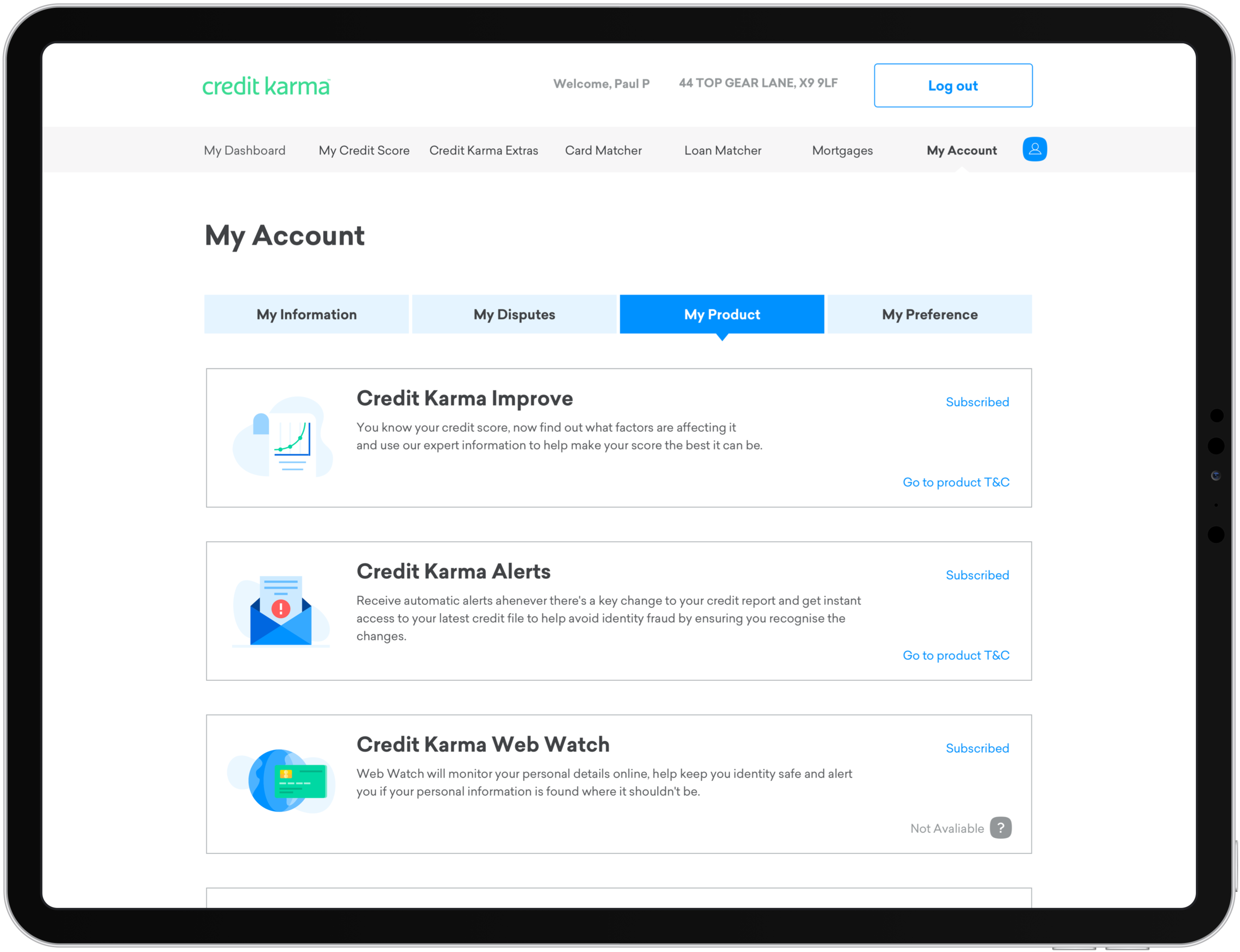
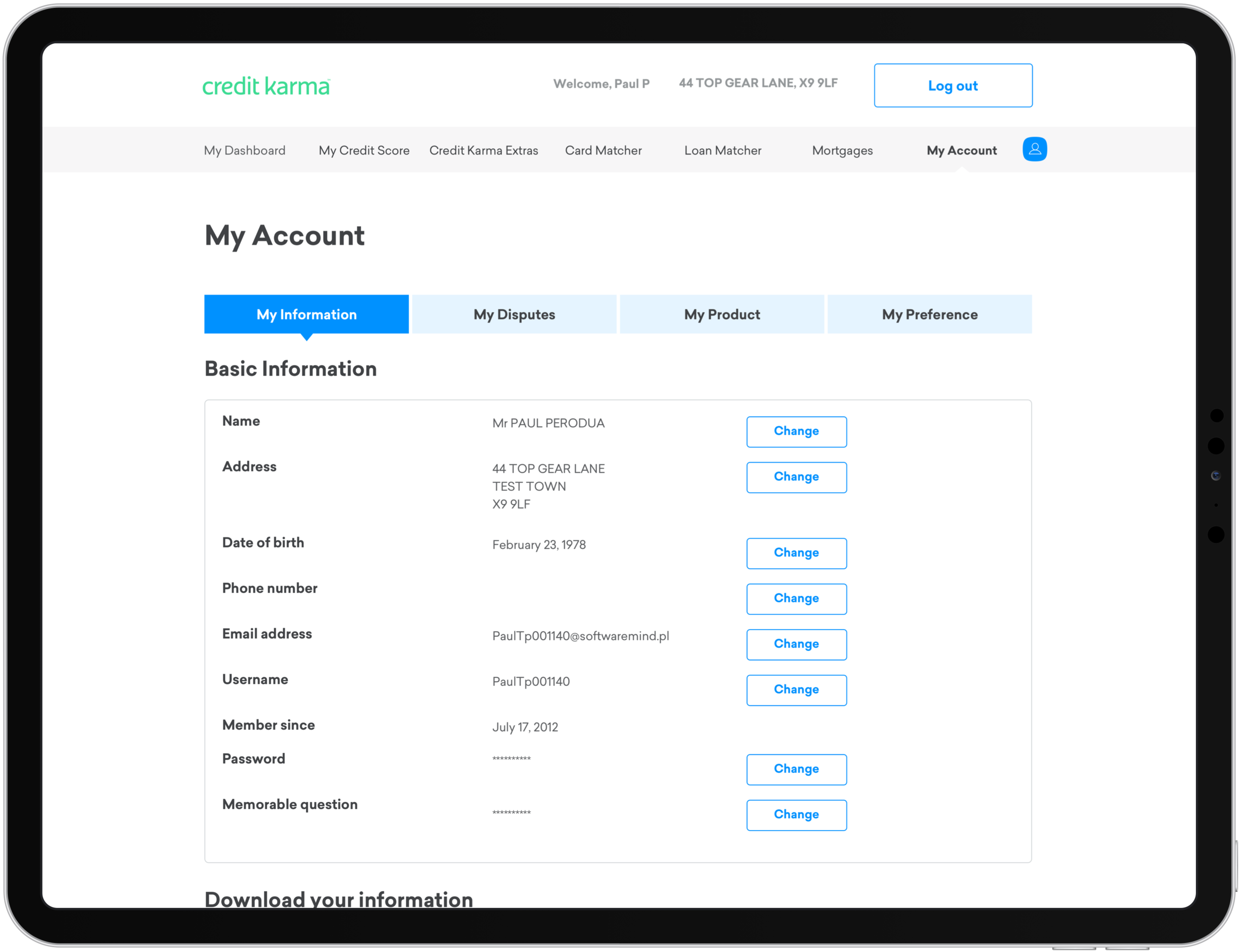
The Product Experience
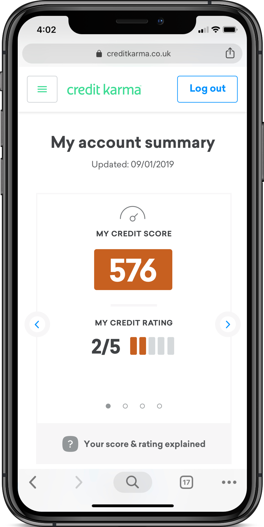
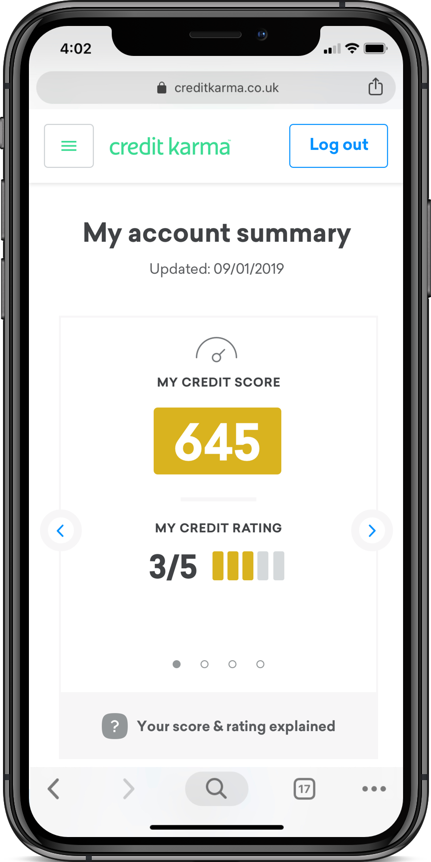
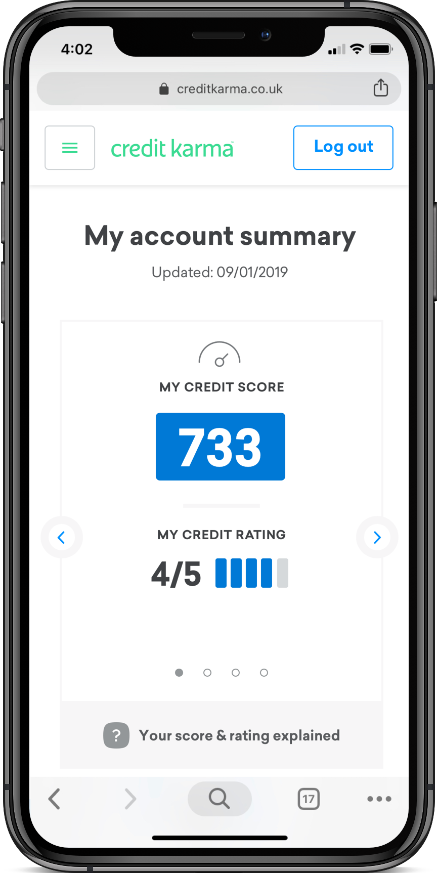
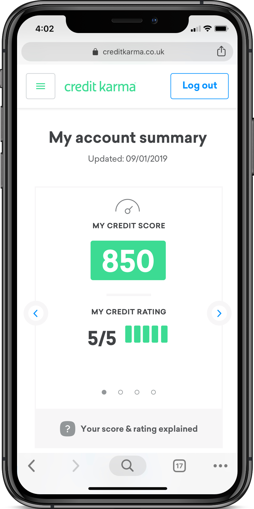
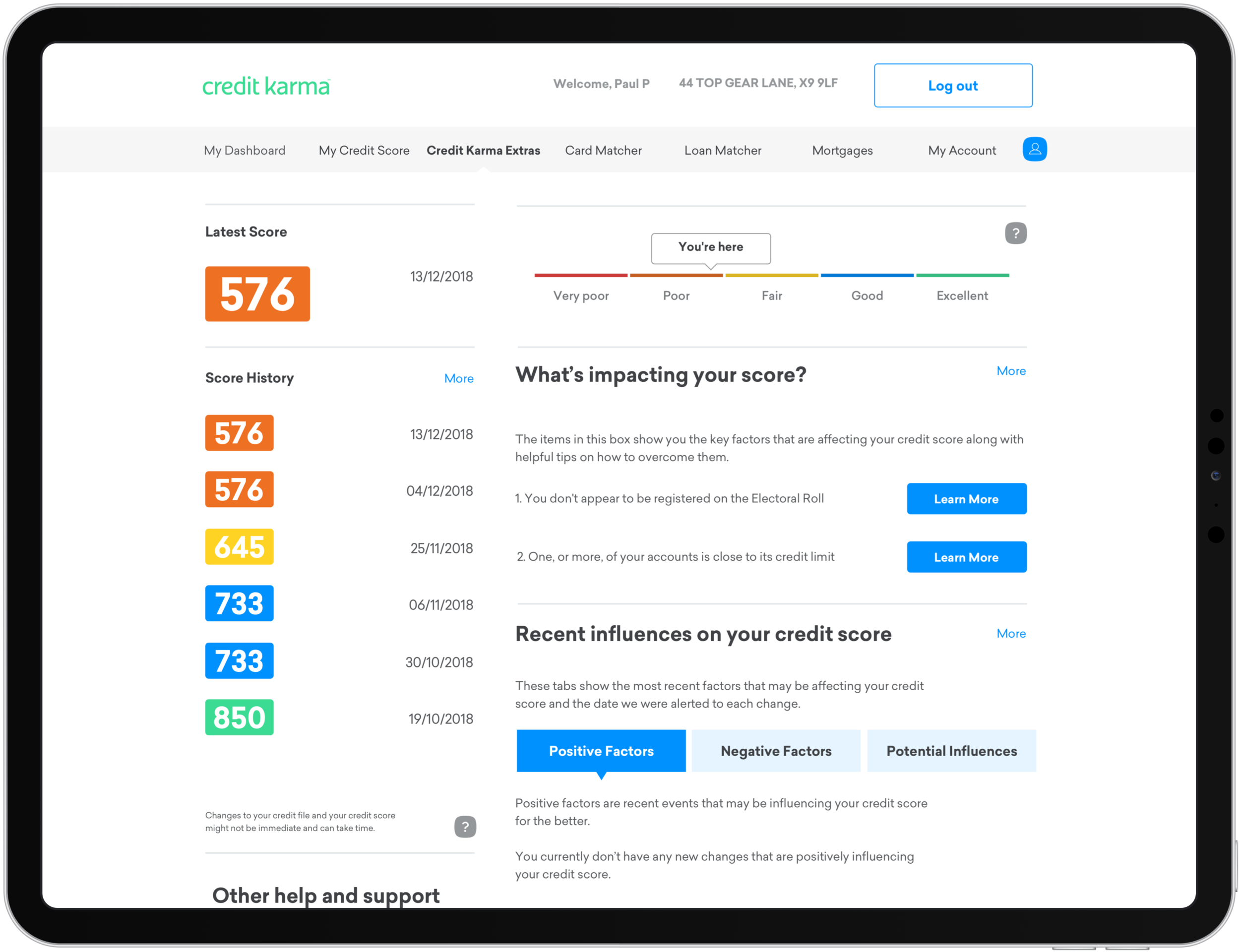
The product experience consisted of: a dashboard for logged in customers, which shows an overview of their credit score and financial tools for credit score improvement; account and privacy settings; password recovery; and emailed credit score notifications.
To communicate Credit Karma’s most important offering quickly on mobile, the visual hierarchy was simplified to focus on the credit score number itself and the graphic system for how the number would be displayed was aligned across the entire product experience.
Developing Visual Design Concepts
for Credit Karma UK
Upon working together and discussing the evolution of the design system, our design lead at Credit Karma asked us to put together some conceptual look and feel explorations for the UK home page. One conceptual direction we studied was the use of Credit Karma’s illustration library, the other using lifestyle photography. Below are conceptual visual design explorations that I developed in conclusion of the project that were illustration driven.